Meet the Pionera Edu Brand
Cue the confetti, because I’m SO excited to share this new brand, Pionera Edu, with you and give you the full, behind-the-scenes look at what I’ve been working on!
When initially putting this brand together, I had a seemingly-disparate vision of what I wanted it to look like: playful, yet refined; witty, yet sophisticated. However, working with a powerhouse of talented designers and writers led me to a brand identity that I’m truly proud of.
THE INSPIRATION
I’ve spent many years working in various facets of education: teaching with students directly in classrooms, working with kids in community programs, and training education professionals on working with youth. With all of my multifaceted passions, I really wanted a home to house my entrepreneurial goals.
For as long as I can remember, I’ve always been inspired by the Spanish culture and aesthetic. It has become a huge inspiration for me, and has led me on the path to develop this refined and confident brand that is mature, yet still witty and playful.
THE NAME
To develop our brand name, we worked with the amazing Kaitlyn Parker and Kari Cotone of Copy Uncorked, a boutique, wine-inspired copywriting agency.
There’s always more to learn, be it new perspectives to hear, new ideas to try, or new ways to innovate. The second you get super comfortable somewhere or with something is when it’s time to try something new.
VP
Inspired by the above sentiment, we want our brand to not only serve as an educational tool, but also invite kids to experience themes, topics, and learning in a new and enticing way. We sought to home in on a name that encapsulates this, and quickly settled on ‘pionera’, the Spanish word for ‘pioneer’ or ‘trailblazer.’ After all, we believe that’s exactly what this brand is: a pioneer for high-quality and accessible education.
THE PERSONALITY
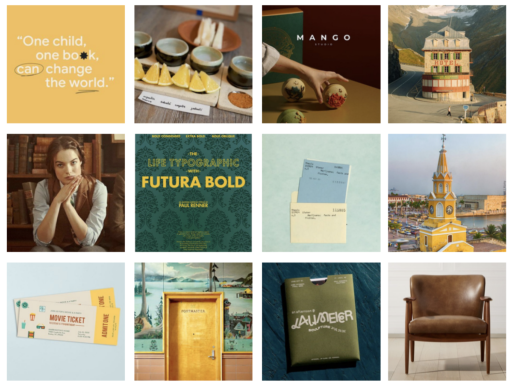
With a brand name squared away, it was time to develop our visual brand. We worked with talented Kadie Smith of Drop Cap Design to breathe life into our vision and translate our brand name into a cohesive visual identity. We settled on the overall vibe of Pionera Edu: classy, clever, and curious — a true student of the world. We wanted our brand elements to be colorful and engaging, without being overly youthful or trend-driven — something timeless, classic, and appealing both to the teacher and to the students.
With a clear direction in mind, Kadie developed three visual themes which are harnessed in our branding.
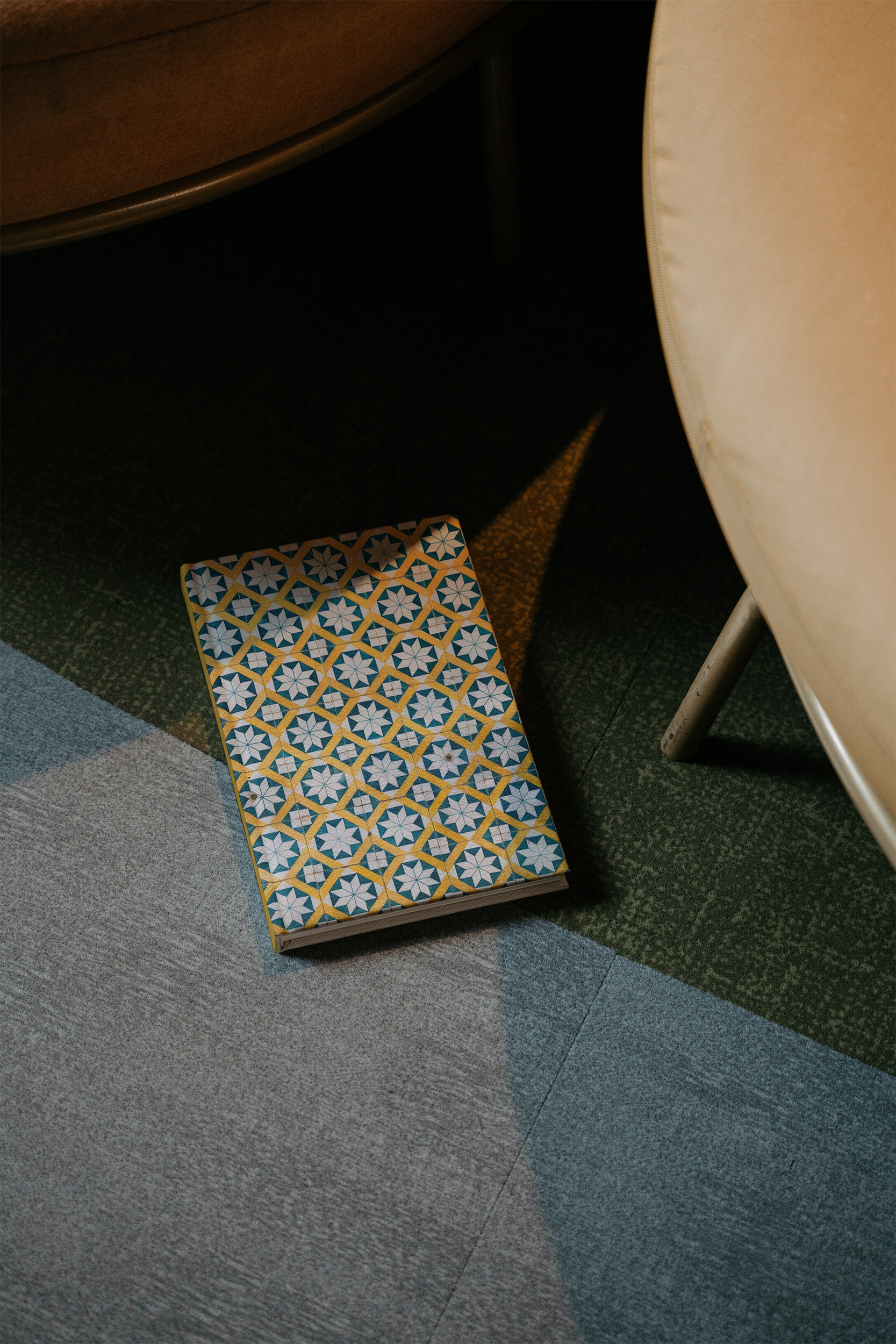
Spanish Study
Inspired by the bold jewel tones and rich, vibrant colors of Spain, the Spanish study is a place where imagination can run wild, where ancient books lay waiting on enameled bookshelves, and where a cozy chair sitting on a vibrant rug and a soft light peering through big windows inspires a long and leisurely day with a book. This style is vibrant and engaging without being aggressive or visually shocking. It’s calm and cool, colorful and yet somehow well-balanced and neutral.
Quirky Classroom
The second theme we want to bring to the brand is a new take on the classroom, and a fresh view on teaching and learning styles. This plays back to the brand’s core mission to make learning accessible and to inspire creativity and curiosity in students. We can accomplish this through unexpected color patterns, thoughtful (gender-neutral) decoration, playful moments and clever, witty banter. The curriculum from Pionera Edu is never boring.
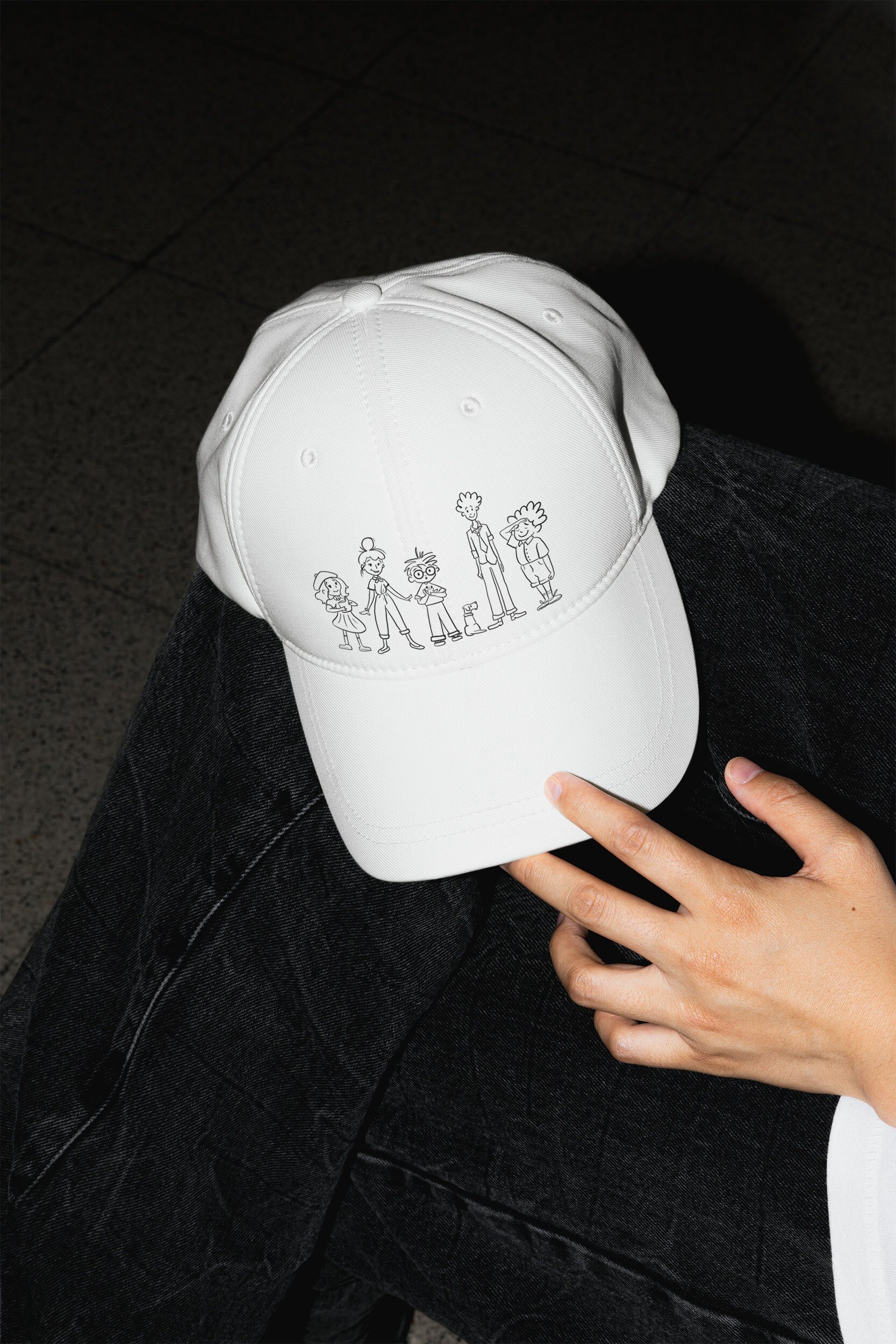
Academic Annotation
The third visual theme we brought to the brand is the use of annotation: the charming scribbles and notes that establish communication between a teacher and student. Our brand brings moments of annotation throughout its visuals and showcases the playful, lighthearted, collaborative side of the brand that leaves room for personalization and relationship-building alongside the more structured and data-driven parts of curricula.
THE BRANDING
Our logo is inspired by Wes Anderson movie sets and European signage:

Our brand style is strong and recognizable, while still having a modern and approachable look and feel. There are subtle adjustments to the typography in our logo that allow the letters to nest next to each other so that the entire logo feels like one solid unit while still having enough negative space to not feel too crowded.
I love the minimal feel of the logo paired with the bold personality it has!
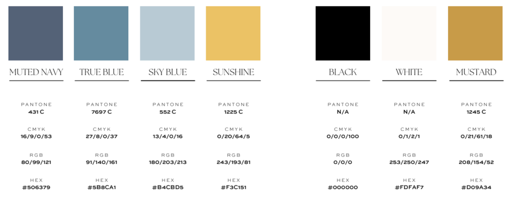
Our color palette is inspired by the rich, vibrant hues in Spanish architecture, the warmth of a saddle leather sofa, and the pop of a goldenrod yellow.
Kadie took the above inspiration and encapsulated it perfectly in a color palette that is grounded, yet refined.
THE FUTURE
With a newfound clarity and vision for a business, I’m super excited for the future. I’m super excited to continue serving our existing clients, meet new ones, and continue to serve youth education professional and families with high-quality services to skillfully empower the youth they work with.
To stay up-to-date on the latest, be sure to join Club Pionera, our inclusive newsletter where we will share tips, tricks, freebies, and anything else that we’re working on!
Here’s to new beginnings… I’m so excited that you’re here as apart of this journey.
Liked that post? Here's more from the journal...
Learn how to find the right tutor, who can transform learning roadblocks into stepping stones, for your child.
PEDAGOGY
Discover what supplemental learning is and its power to promote deeper understanding and independent skills in youth.
FOR FAMILIES
Explore 5 teaching strategies that create a dynamic learning environment and boost student engagement in the classroom.
FOR EDUCATORS
